Assignment 1: Contrasts
The aim of this assignment was to take 8 sets of images which showed contrasts in different ways and one picture with two contrasts.
Initially, I found it very hard to think of appropriate pictures for the assignment, and ended up getting frustrated and left with hardly any ideas. I had to stop and approach the task from a different angle. I started by brainstorming for each category which worked better than simply waiting and hoping to find something that would fit into one of the pairs. This way, It was easier to get ideas for both images in the pair, not just one. Even with this technique, It was still challenging to find subjects for some of the contrasts.
The Contrasts I chose were:
Many/Few
Continuous/
Intermittent
Long/short
Much/Little
Pointed/Blunt
Rough/Smooth
Soft/Hard
Straight/Curved
Transparent/Opaque- 1 Image
Many/few
1a. Many. f/18 2sec ISO-100
1b. Few. f/5.6 0.77sec ISO-100
I decided to stay with the same subject for this pair. For "Many", I scattered the pins and positioned the camera so they filled the frame. I think this better emphasises the point because you don't know exactly how many pins there are, but from what you can see, there are "many". For the "Few" picture, I left 3 pins and positioned the camera a little lower. For both, I used a tripod and light from the nearby window.
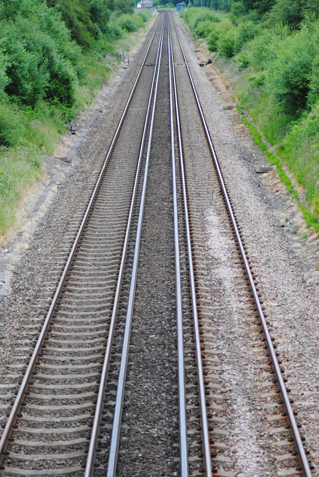
Continuous/Intermittent
2a. Continuous. f/4 1/125 ISO-200
2b. Intermittent. f/5.6 1/30 ISO-220
Continuous and Intermittent were both unplanned and I wasn't originally going to include this category as after finding the train lines for continuous, I could not find a suitable picture for intermittent. The picture for Continuous was taken from a bridge overlooking railway lines. I immediately thought of Continuous or Straight, but at that point I didn't have Intermittent or Curved. I deliberately left out the horizon line for the railway lines as I felt it better conveyed the sense of the lines running into the distance. I found it very hard to find a picture for Intermittent, as I really didn't want to go for more obvious subjects like dashed road markings. I converted to black and white because I found the background distracting and I think it also makes you focus more on the raindrops and not through the glass.
Long/ Short
3a. Long. f/14 5sec ISO-100
3b. Short. f/16 1.6 sec ISO-100
I'm not completely happy with both these pictures, though I'm not sure why. They were both taken in the same conditions as Many/Few using a tripod and light from the nearby window. I chose to include the ball of string for Long and to have it continuing out of the frame. I cut off the end of the string for Short and took the picture close up and with a wide aperture. I felt this better conveyed "short" as you can see how small the piece of string is, and therefore how short it is.
Much/Little
4a. Much. f/5.3 1/120 ISO-400
4b. Little. f/4.2 1/60 ISO-200
Again, I'm not really happy with these, I think it might be the colour or the angle. I used the same subject and conditions for both pictures. I would have preferred to have used a plain white plate, but at time, I couldn't find one. I wanted to show "much" and "little" as the biscuits before and after they were eaten.
Pointed/Blunt
5a. Pointed. f/5.3 1/60 ISO-100
5b. Blunt. f/5.3 1/125 ISO-200
I was originally going to use the "Pointed" picture for "diagonal" but felt it better suited pointed, because after all, forks are sharp and pointed. I thought that crossing the forks and adding the water droplets added more interest to the picture, and used a wide aperture to emphasise the sharp edges. I found these metal traffic bollards and thought they would be ideal to use for my "blunt" picture. I think their bright colour also makes them stand out and you can clearly see their shape against the grey background.
Rough/Smooth
6a. Rough. f/5.6 1/200 ISO-400
6b. Smooth. f/9 2.5sec ISO-100
Rough/Smooth was one of the easiest category's I found to get idea's for, though both I think are a bit obvious. I had had the idea of tree bark for "rough" since starting the assignment, so the only problem I had was finding a suitable tree. I was at first going to crop so only the bark was visible, but I think that leaving the green background helps to give some sense of space and scale, even if it's not much. I used a wide aperture to focus on part of the bark to help draw the viewers eye to the rough texture. The picture of the eggs was taken indoors using light from the window. Again, I think the idea is not very original, but I do like how smooth the eggs are, especially in contrast to the bark, so didn't want to pass up the opportunity to use them.
Soft/Hard
7a. Soft. f/5.6 1/30 ISO-250
7b. Hard. f/6.3 1/60 ISO-200

I had decided on using a stone wall for "hard"-provided i could find one- but I found it more challenging to find a subject for "soft". I considered using a feather, but didn't have one to hand at the time, so I started thinking about cotton wool and similar objects as being "soft" and fluffy. I didn't chose cotton wool because apart from being plain white, it is fairly shapeless and would have been difficult to make an interesting picture from. So I chose cotton buds, as they at least have some form and would not be just a mass of white. I focused on the front few buds, using a wide aperture to help with the "soft" feel, and making sure to keep some of the colour in between the white ends to separate them. For the "Hard" picture, I travelled to my local town to find stone walls, and after taking a selection of pictures, chose this one to represent "Hard". I like the rough texture and the grass growing on top of it, which makes me think it must be "hard" to support the ground above it.
Straight/Curved
8a. Straight. f/10 1/30 ISO-200
8b. Curved. f/4.5 1/400 ISO-200
Straight and Curved were both unplanned images I took whilst walking around town, originally looking for Rounded and Diagonal objects. The metal cover of a shop front immediately caught my eye as an image for "straight", though now I think it was a bit of an obvious subject to use. I positioned the camera close to the surface to give a more interesting perspective and to draw attention to the lines. I saw the double yellow lines around a mini roundabout and although I had considered finding road lines for "straight", I liked the way they curved smoothly with road, mirrored by the also curving pavement. I was going to keep the picture in colour, but chose to convert to B/W because I found the grass and bushes in the background very distracting. Incidentally, it also made the lines on the road stand out which I think added to the effect of the image. This, I think is my favourite picture in the series.
Transparent/Opaque- Contrast in 1 image
9. Transparent & Opaque. f/10 1/1000 ISO-400
This was the first picture I thought of when planning the assignment, which came as a bit of a surprise to me- I had thought this one would be the hardest to get ideas for! I filled a glass with water then poured a little milk into it. I took pictures at various stages of the mixing liquids and it took a few attempts to get the result I wanted, but in the end I am fairly happy with the picture. I think it could be improved both technically and compositionally but I am still pleased with the effect of the image, and think it appropriately conveys the subject.
In conclusion, I am pleased overall with this assignment, though I still think there is a lot I could improve on. I need to work on the technical side of my photography as well as my creativity and being able to think original ideas, but I'm sure that will come with time as I continue the course. On the other hand, I am starting to think more about the pictures I take, and I'm also experimenting with a wider range of subjects and techniques since starting the course.